Deadline Flyer
This is a design I did for an upcoming deadline at Utah State.
Design Thoughts:
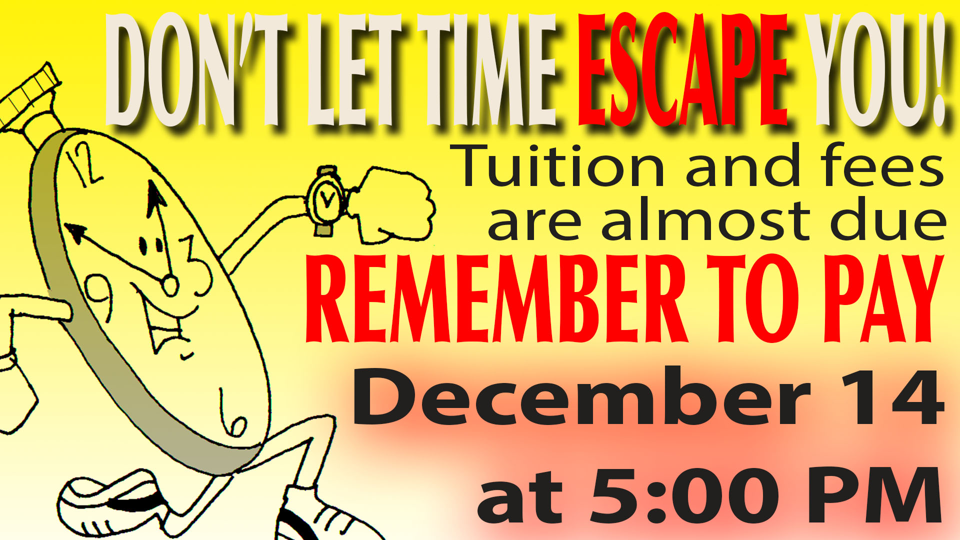
I knew I wanted to do something pretty simple that had a meaningful impact. What I ended up coming up with, was this funny play on words about time "running" out. I found a cool graphic that demonstrated what I was looking for (see courtesy below). I think college students will be able to connect with this message because time is always getting away from us.... and it can be scary! We don't want valuable time to escape us! So from there, I just worked off that main idea. I wanted my attention grabber (time escaping) and the solution (remember to pay) to be the first things students would see when they looked at this design. I made those the biggest and used the boldest font, paired with an eye catching color. I've read before that yellow and red draws attention quickly (think of fast food restaurants like McDonalds) so I played around with those colors until I had something I liked. I then found a more generic font to use for the rest of my typography (the details students need to know - what's due and when). I made the due date large and bold because that is the most important information on this flyer and I wanted to make it obvious.
Tools Used:
• paint bucket
• gradient tool
• drop shadow
• free transform
• typography
• spacing tools
• photoshop masks
Image Credit:
http://www.sawyoo.com/post_cartoon-clock-clip-art_104443/
Design Thoughts:
I knew I wanted to do something pretty simple that had a meaningful impact. What I ended up coming up with, was this funny play on words about time "running" out. I found a cool graphic that demonstrated what I was looking for (see courtesy below). I think college students will be able to connect with this message because time is always getting away from us.... and it can be scary! We don't want valuable time to escape us! So from there, I just worked off that main idea. I wanted my attention grabber (time escaping) and the solution (remember to pay) to be the first things students would see when they looked at this design. I made those the biggest and used the boldest font, paired with an eye catching color. I've read before that yellow and red draws attention quickly (think of fast food restaurants like McDonalds) so I played around with those colors until I had something I liked. I then found a more generic font to use for the rest of my typography (the details students need to know - what's due and when). I made the due date large and bold because that is the most important information on this flyer and I wanted to make it obvious.
Tools Used:
• paint bucket
• gradient tool
• drop shadow
• free transform
• typography
• spacing tools
• photoshop masks
Image Credit:
http://www.sawyoo.com/post_cartoon-clock-clip-art_104443/
