Info Flyer
Design thoughts:
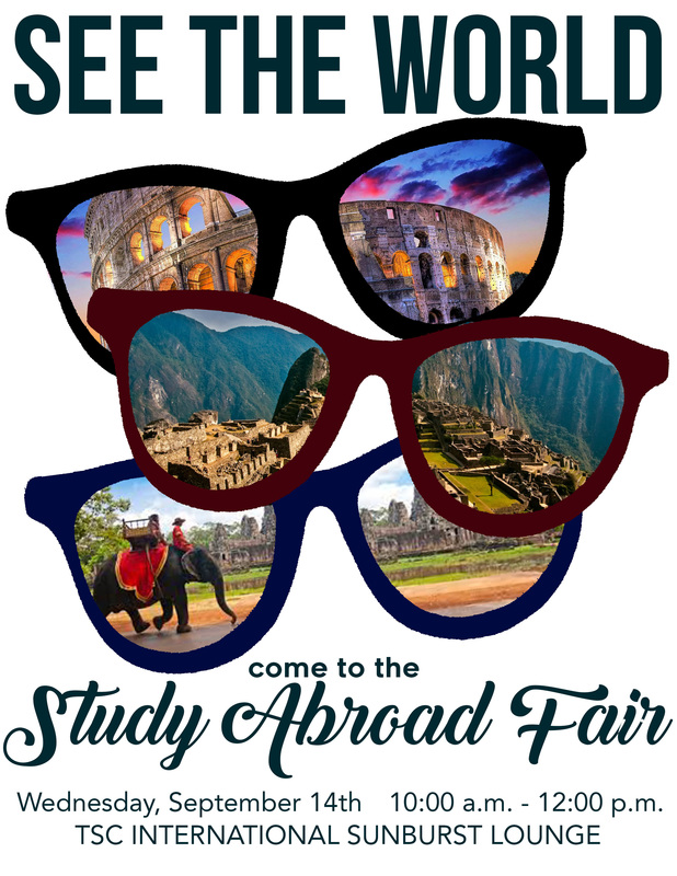
• Contrast: The colors of the sunglasses, text and images all contrast from the plain white background. The font’s I’ve used contrast from each other, making the details of the flyer really stand out.
• Repetition: The repetition of the sunglasses helps pull the flyer together. They also help the viewer’s eyes go from top to bottom, first capturing their attention, and then coming down to the information they need.
• Alignment: The alignment of this design is down the center. Again, I think this helps to guide the viewer’s eyes.
• Proximity: The design of this photo (the sunglasses) are all close to each other, helping to group the most eye catching part of this flyer. Then the important when/ where information is located together down at the bottom of the flyer.
Photoshop Skills Used:
• Layers for each of the main elements on the page.
• The eraser tool.
• Contrast and saturation sliders used to enhance the colors of the images.
• Text tools to create the text layers.
Sources for images I've used: http://www.freeimages.com
Fonts Used:
Bebas Neue at the top.
Renogare for the “come to the”
Back to black for the “study abroad fair” Avenier for the rest.
I wanted to create something that would inspire people to study abroad. The biggest appeal of studying abroad is obviously the travel that is possible, so I knew I wanted to focus on that aspect as my main message. I saw something online that inspired me to put cool landmarks inside sunglasses to symbolize the potential to be able to see the world. Once I had that idea set, everything else just kind of fell together to create this final piece of art.
