Business Card
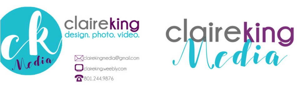
My thoughts about the design of this image... I am proud of how this design turned out. I think it is simple and easy to read while still exhibiting my creativity and eye for design.
Contrast: The grey, teal and purple complement each other well. They are all very different from each other, helping to contrast specific details. They also contrast from the white background, making the design pop out and grab attention.
Repetition: I used two different fonts throughout and the colors repeat each other.
Alignment: I think this is pretty balanced. All the information is on the right side of the card, while my logo is aligned toward the left.
Proximity: There are three groupings on my card. The first is my ck Media logo. The second is where is describes what I can assist in. And the third gives my contact info. I think it works nicely together.
How I created this image in Photoshop: Honestly, just a lot of playing around! I originally had a pretty different idea in mind as well as an entirely different color scheme. But after messing around with each section for a while, I was inspired to create this final product! The images of the envelope, computer and phone are vectors that I created in illustrator and then copied into Photoshop.
Fonts: champagne and limousines AND salsabilla
